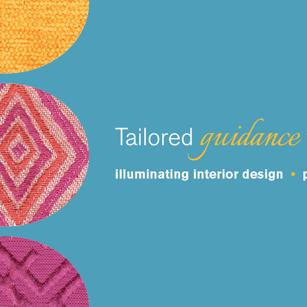
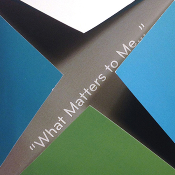
Identity Design Refresh
Client: Daybreak Interiors
Services provided: Identity design, project management
This interior design firm needed to refresh its logo and other identity elements after shortening the company name and adding a new tagline. The updated designs of both letterhead and business cards have new fabric swatch images that better represent and reflect the brand colors in the logo’s icon. Refreshing the layout of the back side of the business cards improves the overall balance and highlights the new tagline.